
I served as senior designer and photo art director, collaborating with the team on the product launch campaign for RadKick, Rad Power Bikes’ new, lower-priced, high-value ebike. Designed for college students and urban dwellers, this model offers a lighter weight and a more affordable price point, making it ideal for city living and budget-conscious riders.
The campaign concept, Meet Your New Sidekick, positioned the RadKick as the perfect companion for everyday adventures: running errands, hitting the gym, or meeting friends for brunch. We crafted a fun and approachable narrative to make ebikes more accessible to first-time buyers. Visually, the campaign drew inspiration from social media trends to create an authentic connection with a younger, digitally savvy audience.
Client —
Rad Power Bikes
Credits —
Creative Director: Marina Harnik
Copywriter:
Justin Duckham
Visual Designer: Jessica Cantwell
Photo Producer and Stylist: Jacqui Trent
Project Manager: Grace Dwomoh
Lifestyle Photography: Arisa Yoon
Lifestyle Videography: Carson Talbert
Editorial Studio Photography and Videography: Ky Elliot
My Role —
Senior Visual Designer, Concept Development with Creative Team, Design Ideation, Photo Art Direction (served as the sole art director for the lifestyle shoot, guided by planning discussions with the Creative Director)
Connected TV and Social Media Videos:
The campaign featured 30-second and 15-second videos that ran on connected TV (CTV) and across various social media platforms. While the new RadKick took center stage, the videos also showcased legacy models, highlighting the full Rad Power Bikes lineup to appeal to a broad range of viewers.
1. Broad Use, Product Hero Image (Awareness) 2. College Students, Female Lifestyle Hero Image (Consideration) 3. Broad Use, Male Commuter Hero Image (Awareness) 4. Commuters, Female Lifestyle Hero Image (Consideration)
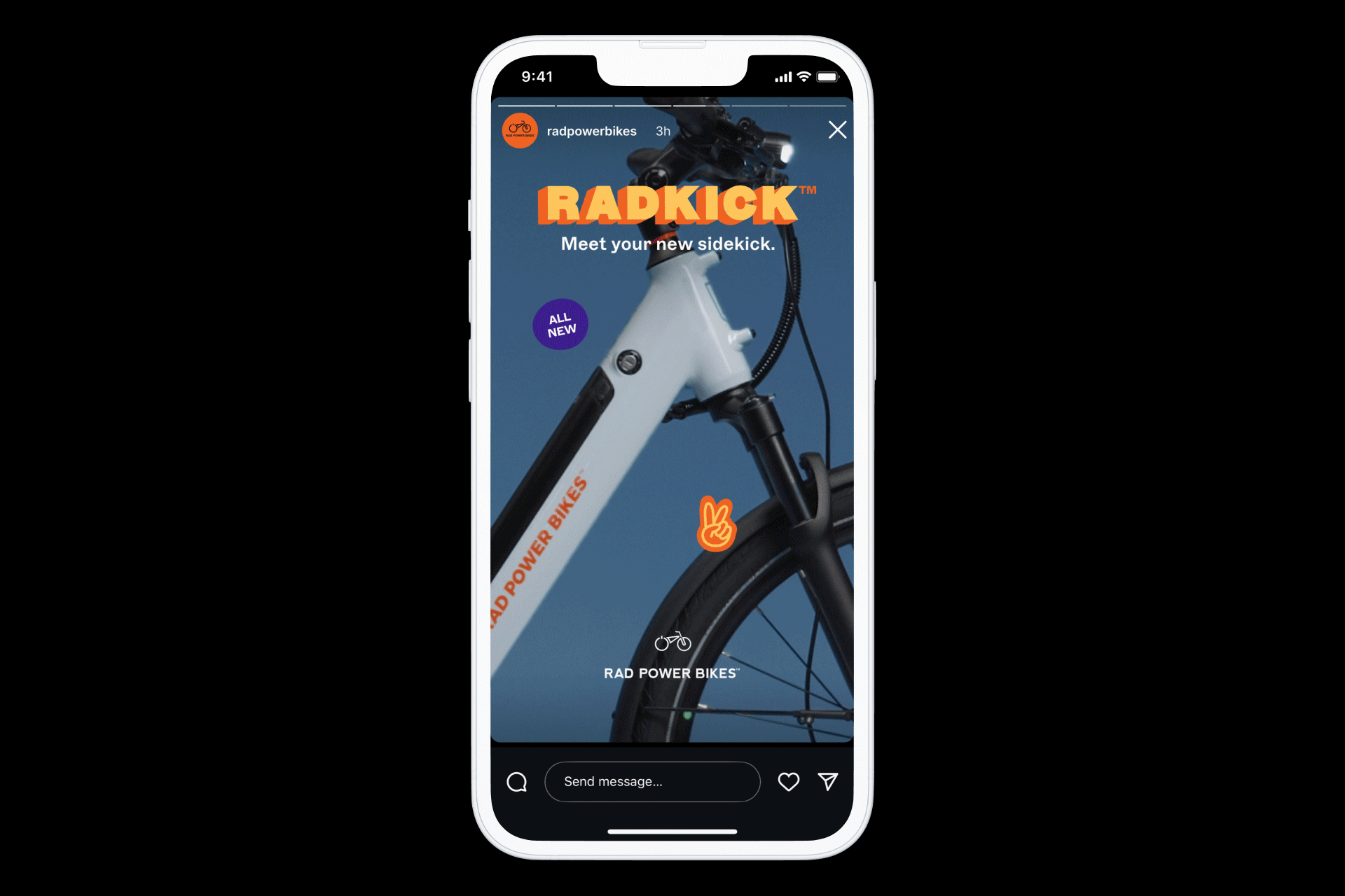
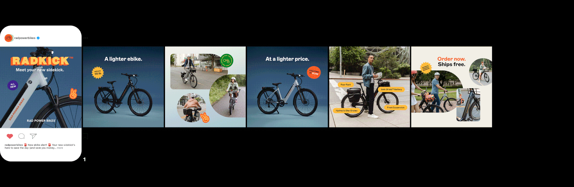
Paid and Organic Social Media:
To support the campaign, we created a range of paid and organic social assets. We tested visual variations in imagery, layout, and messaging to drive engagement with a younger audience. While the visual system remained clean and focused on the bike, each version was tailored to meet specific platform requirements and campaign goals. Our design approach balanced brand consistency with targeted experimentation, aligning performance data with visual storytelling.
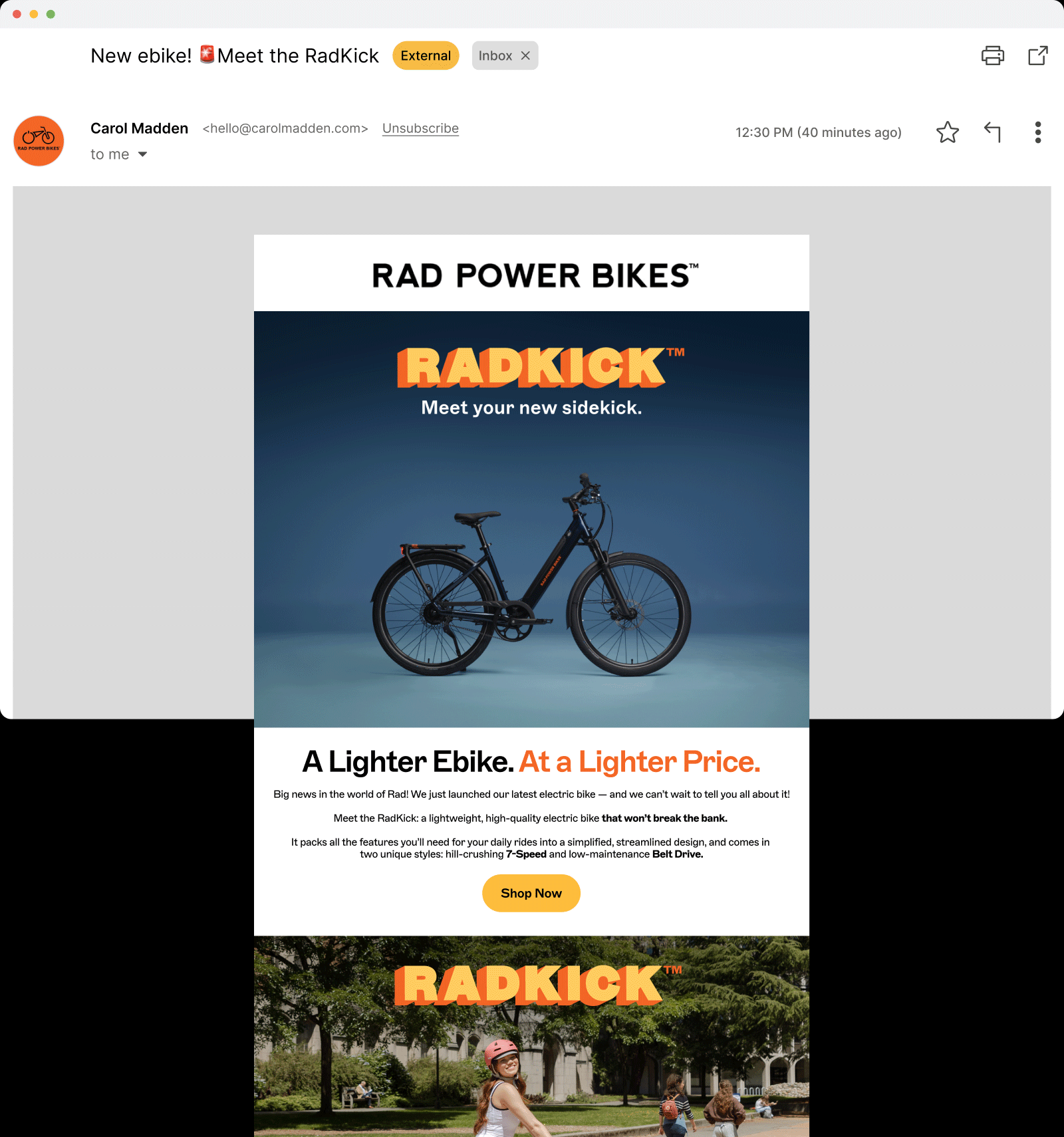
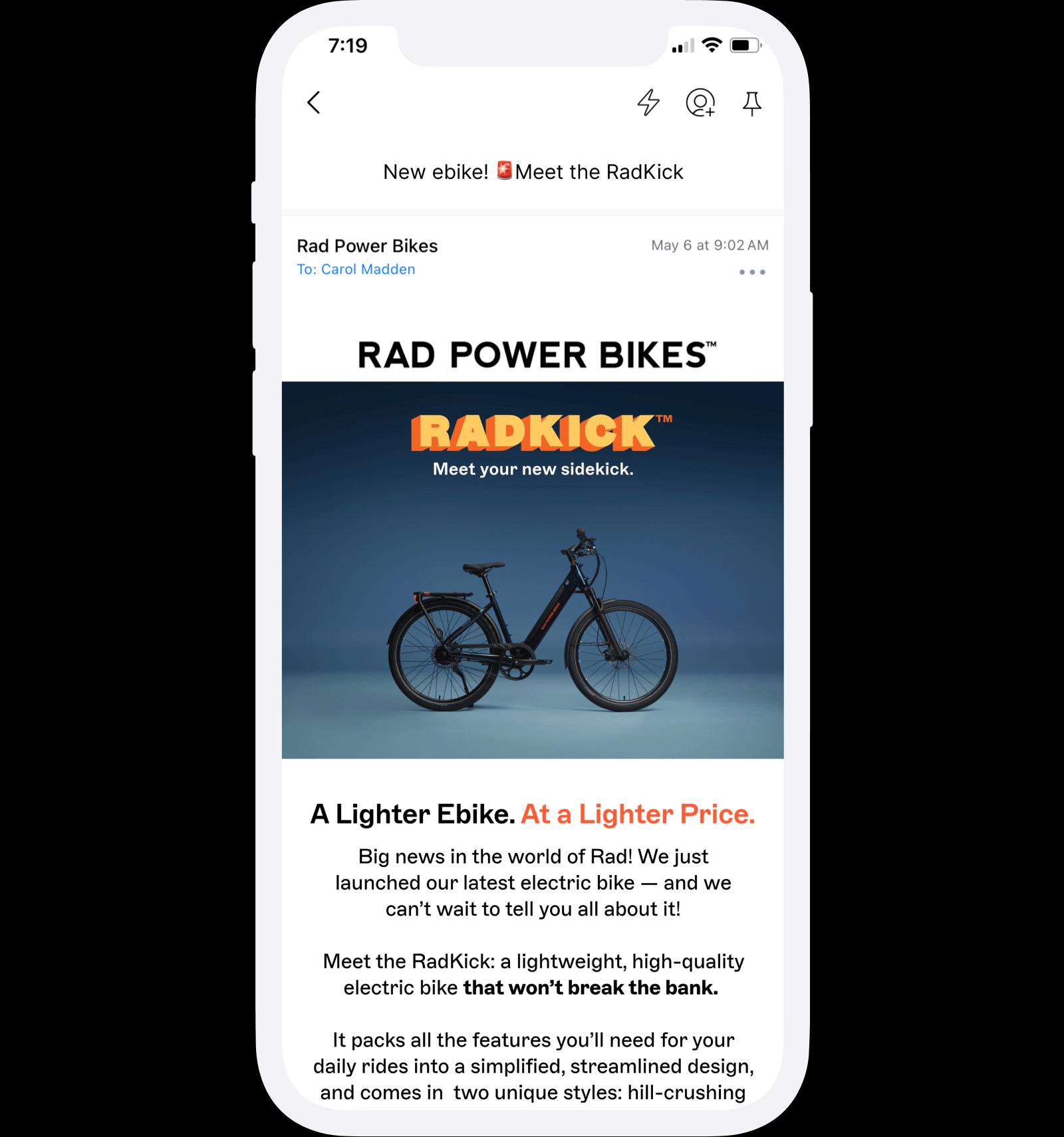
Email:
We adapted the campaign’s visual elements into a clean, mobile-optimized email series—prioritizing legibility, fast load times, and a seamless user experience across devices. Design decisions were guided by performance best practices and built responsively in Klaviyo.

Landing Page:
The landing page drew inspiration from social media, featuring a bold, chunky lockup, brightly colored sticker-style elements, and playful, curvy photo frames that added energy and fun to the design. The clean, easy-to-navigate design clearly highlighted the key benefits and differences between the two RadKick models, helping shoppers make confident choices.

Store Signage:
For retail stores, we designed a single sign that effectively communicated the key differences between the two RadKick models. This signage was placed next to the bikes on display to provide clear, quick information to customers.

One-Pager:
For every new product launch, we create a one-pager that highlights all the key bike specifications. It’s distributed in stores as a printed flyer and shared digitally with publications and affiliates. While the design leans more toward company branding rather than campaign-specific branding, it incorporates campaign photography to maintain visual consistency.