For the launch of Rad Power Bikes’ 2024 lineup, I served as the Senior Visual Designer, shaping the campaign for four new models: Radster Trail, Radster Road, RadWagon 5, and RadExpand 5 Plus. Inspired by nostalgia and good vibes, the design language blended retro elements with modern boldness. Vibrant layouts, rounded forms, and a playful color palette created a sense of smoothness, warmth, and joy. The visuals were unified across digital and physical touchpoints, highlighting each bike’s unique styling while reinforcing Rad’s spirited, approachable brand identity.
Client —
Rad Power Bikes
Credits —
Creative Director: Marina Harnik
Copywriter:
Justin Duckham
Visual Designer: Jessica Cantwell
Photo Producer and Stylist: Jacqui Trent
Project Manager: Grace Dwomoh
Lifestyle Photography: Arisa Yoon
Lifestyle Videography: Carson Talbert
Editorial Studio Photography and Videography: Ky Elliot
Motion Designer for Social Media: Boyd Veger
Motion Designer for Social Media: Boyd Veger
My Role —
Senior Visual Designer, Concept Development with Creative Team, Design Ideation, Photo Art Direction (supported the Creative Director during a three-day lifestyle shoot and an editorial studio session, serving as the lead photo art director on the final day of the lifestyle shoot)


Photography & Videography Direction:
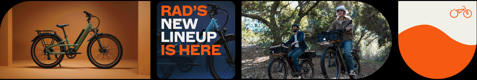
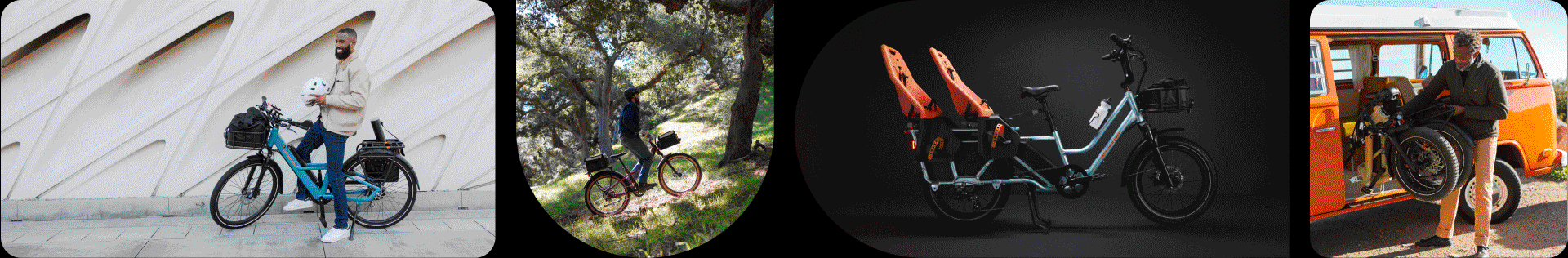
The photography and video direction focused on capturing real-world moments that reflected the spirit of adventure, freedom, and community at the heart of the Rad brand. Each bike was shown in diverse outdoor settings to highlight its unique styling and all-terrain versatility. Both photography and cinematography embraced an authentic, in-the-moment approach—featuring candid interactions, moments of laughter, and subtle fourth-wall engagement to create a sense of connection and spontaneity.
This visual storytelling was enhanced by a bold, complementary color system that tied each model’s paint finish to Rad’s broader brand palette, creating consistency across assets and reinforcing the campaign’s approachable tone.
Connected TV and Social Media Videos:
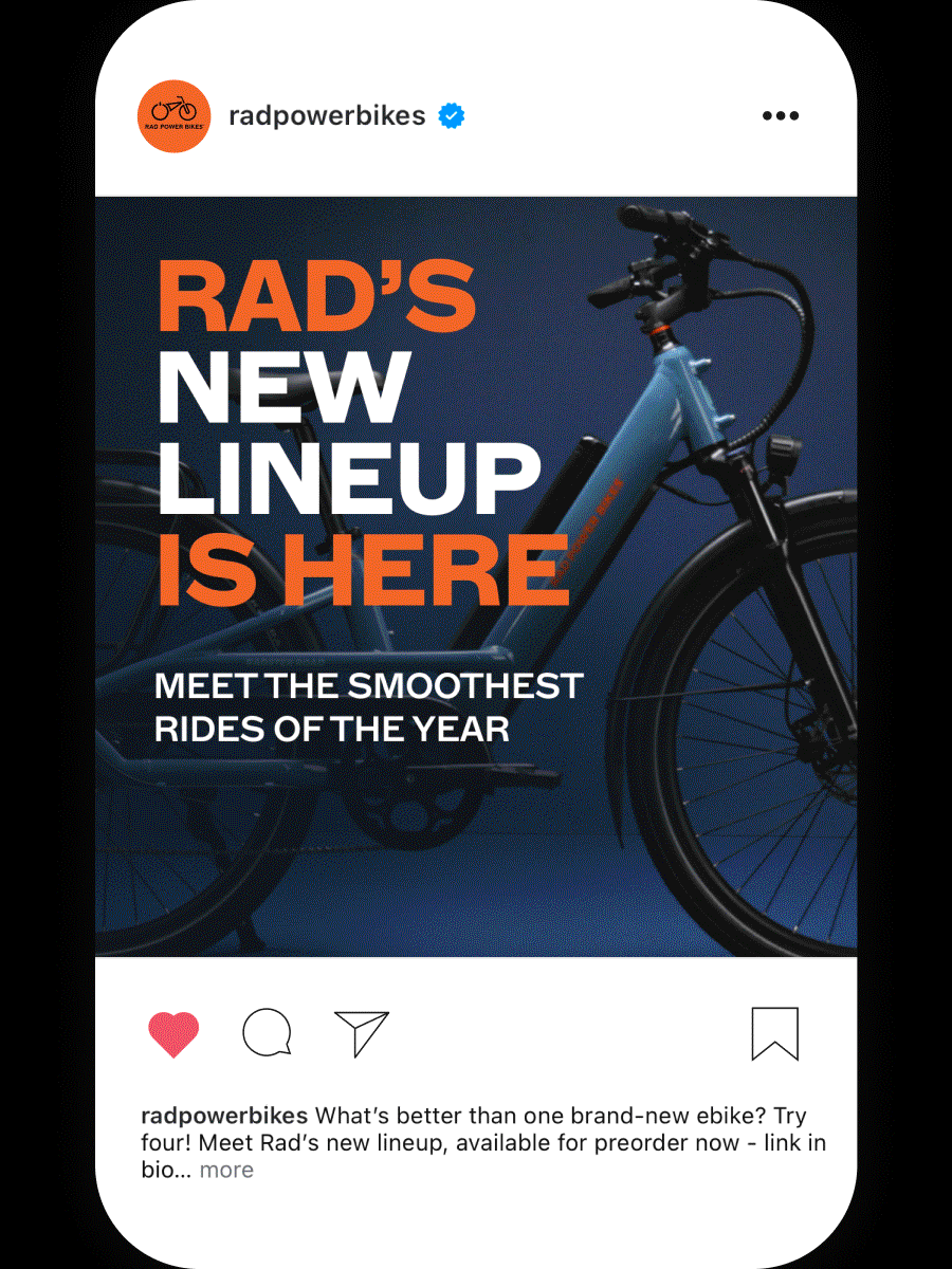
The campaign included 30- and 15-second video spots designed for connected TV and social media platforms. These high-visibility assets introduced Rad’s largest product launch to date, featuring all four new models in action. The videos were anchored by the line Feels Smooth. Looks Smooth., with variations like Feels smooth on the go. Looks smooth off the grid. These rhythmic statements emphasized both ride experience and visual appeal, helping to build a clear and memorable narrative across formats.
Each video was optimized for short-form viewing, using fast pacing, bold visuals, and emotionally engaging moments to capture attention and drive product interest across digital channels. Music selections added to the overall tone with nostalgic, feel-good energy that deepened emotional connection and reinforced the campaign’s vibrant, playful spirit.
Paid and Organic Social Media:
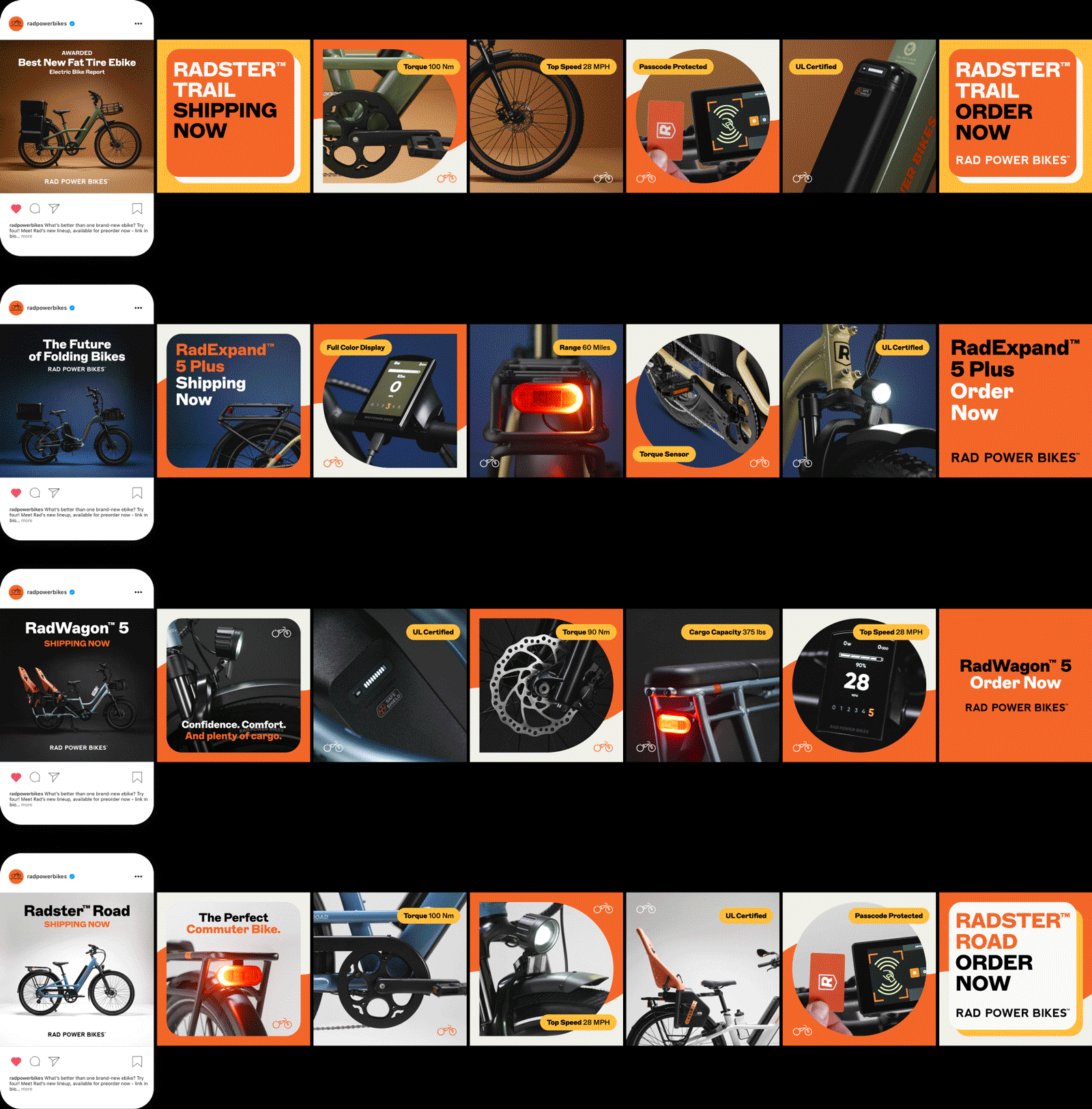
To support the 2024 Lineup launch, we developed a suite of paid and organic social assets for each phase of the campaign: preorder, ready-to-ship, and evergreen. Deliverables included video, carousels, and static placements, all unified by a bold, retro-inspired visual system. A standout preorder video introduced all four models through energetic motion design and debuted Rad’s Safe Shield Battery, highlighting its enhanced safety features.
Supporting carousels combined lifestyle and product photography to spotlight key specs and benefits. We tested lifestyle-forward, product-focused, and hybrid variations to assess performance and used the insights to inform future creative direction. The result was a cohesive campaign that blended storytelling with strategic design experimentation.
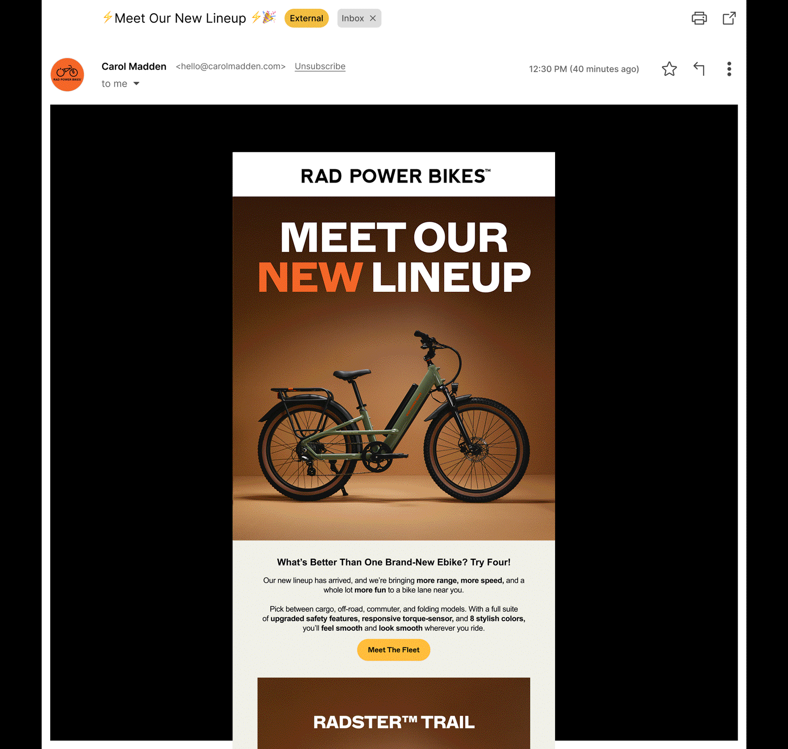
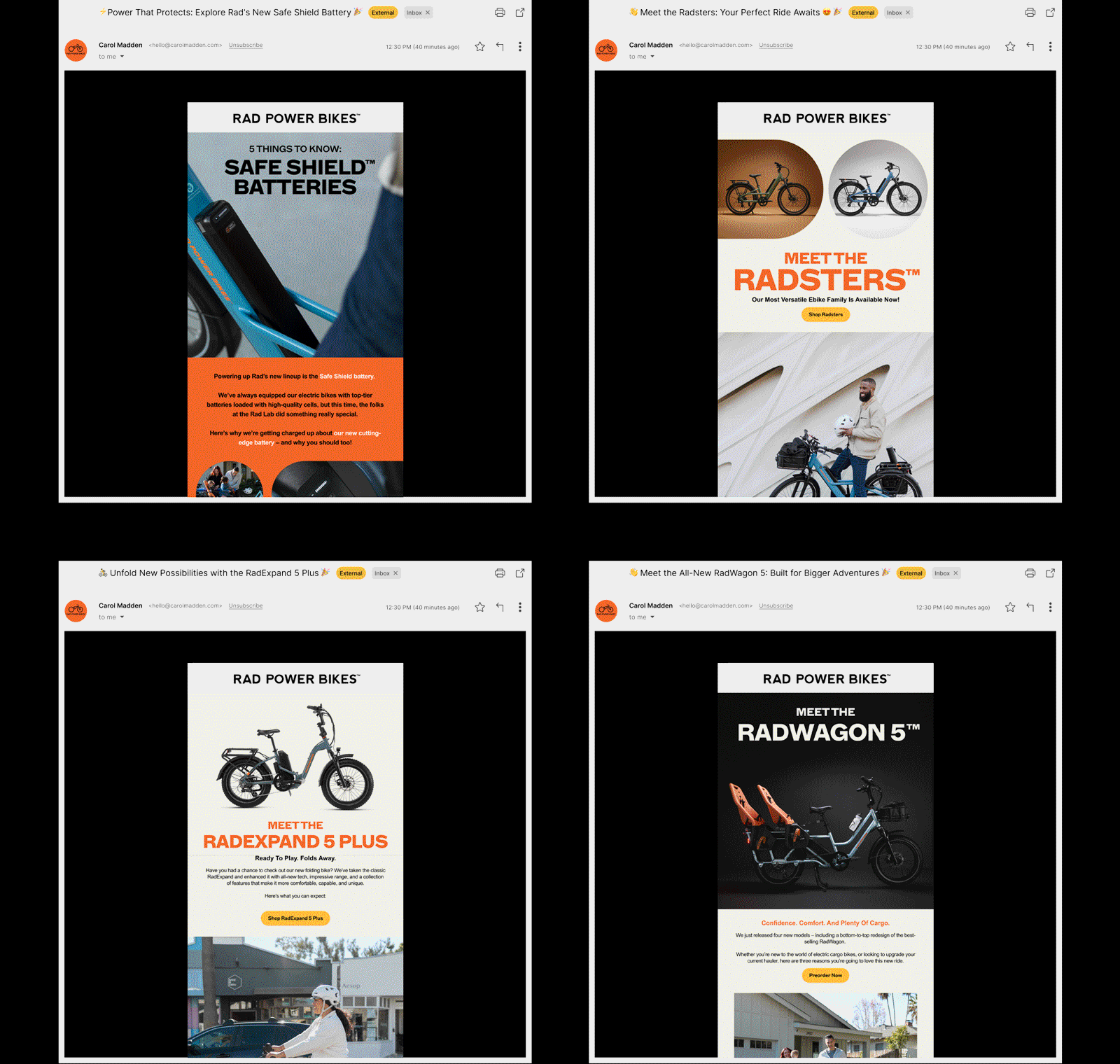
Email:
The 2024 Lineup email campaign extended the launch’s bold, retro-inspired look with rounded shapes, vibrant colors, and clean layouts built in Klaviyo. Designed to be fully responsive across desktop and mobile, the emails balanced brand expression with legibility, intuitive navigation, and fast load times. The series began with a launch email introducing all four models, followed by targeted sends that spotlighted individual bikes, highlighted key specs, and drove traffic to product pages. The result was a cohesive, high-performing campaign that reinforced key messaging across digital touchpoints.
Landing Page:
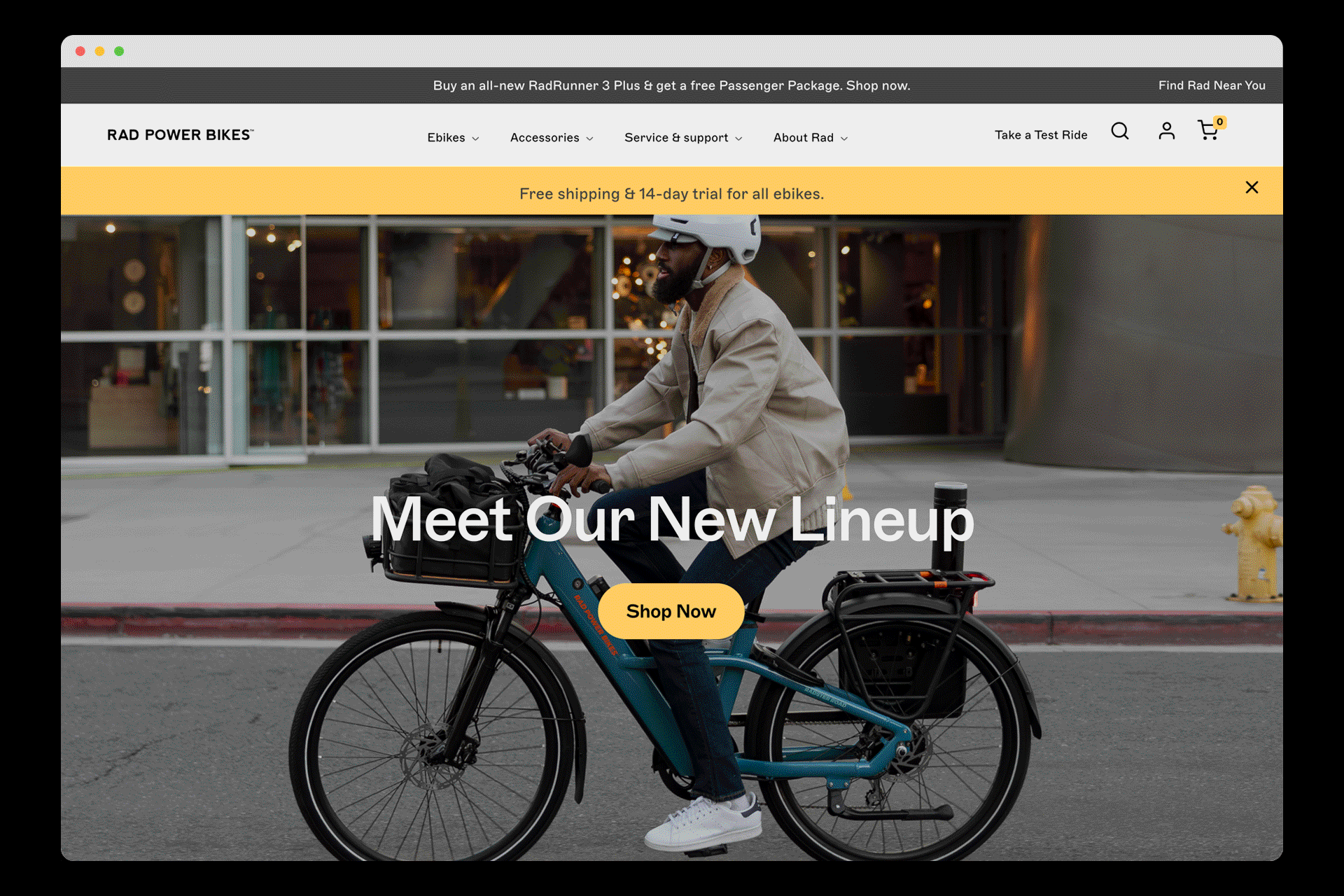
The 2024 Lineup landing page served as the central hub for Rad Power Bikes' largest product launch to date. Designed for clarity and ease of navigation, the page highlighted key features of each model, helping visitors quickly understand the unique benefits of every bike. A streamlined layout guided users to each product detail page, enhancing the shopping journey with intuitive navigation and engaging visuals that supported exploration.
To create a cohesive brand experience, the design embraced Rad's bold color palette, pairing the signature orange with distinct hues for each model. Rounded shapes such as pill forms, soft rectangles, and circles added a playful visual rhythm that echoed the bikes’ smooth ride experience. These elements created dynamic transitions and contributed to a sense of movement across the page.
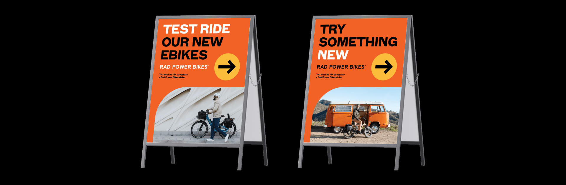
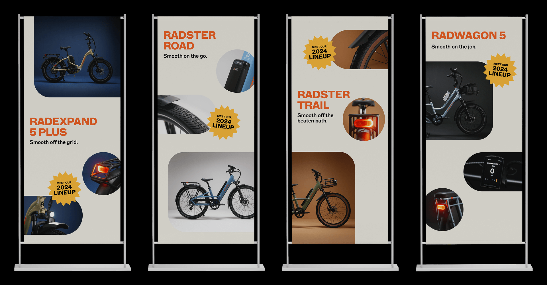
Store Signage:
The 2024 Lineup launch extended into retail spaces with bold, visually engaging signage designed to drive awareness and highlight the new models. Key installations included an A-frame wayfinding sign placed outside the storefront, inviting passersby to test ride the latest bikes. This high-visibility placement served as an entry point, encouraging hands-on interaction and discovery.
Inside the store, individual posters showcased each bike, leveraging the editorial studio photography to capture the essence of each model. The clean, elevated imagery blended seamlessly with the retro-inspired design language of the campaign. Rounded shapes and a rich color palette added visual consistency across touchpoints, amplifying the playful, inviting spirit of the lineup.
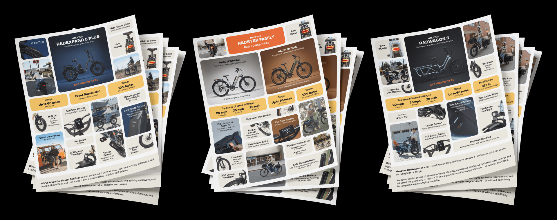
One-Pager:
For the 2024 Lineup launch, we created a series of one-pagers that highlighted key specifications and standout features for each model. Radster Trail and Radster Road were combined into a single, streamlined flyer, while RadWagon 5 and RadExpand 5 Plus each received their own dedicated one-pagers.
Designed for both in-store distribution and digital sharing, these assets served as quick-reference guides for customers, retail staff, and affiliates. While the design leaned more toward company branding, campaign photography was integrated to maintain visual consistency across touchpoints. Each layout prioritized clarity and accessibility, making it easy for readers to understand the unique benefits of each bike at a glance.