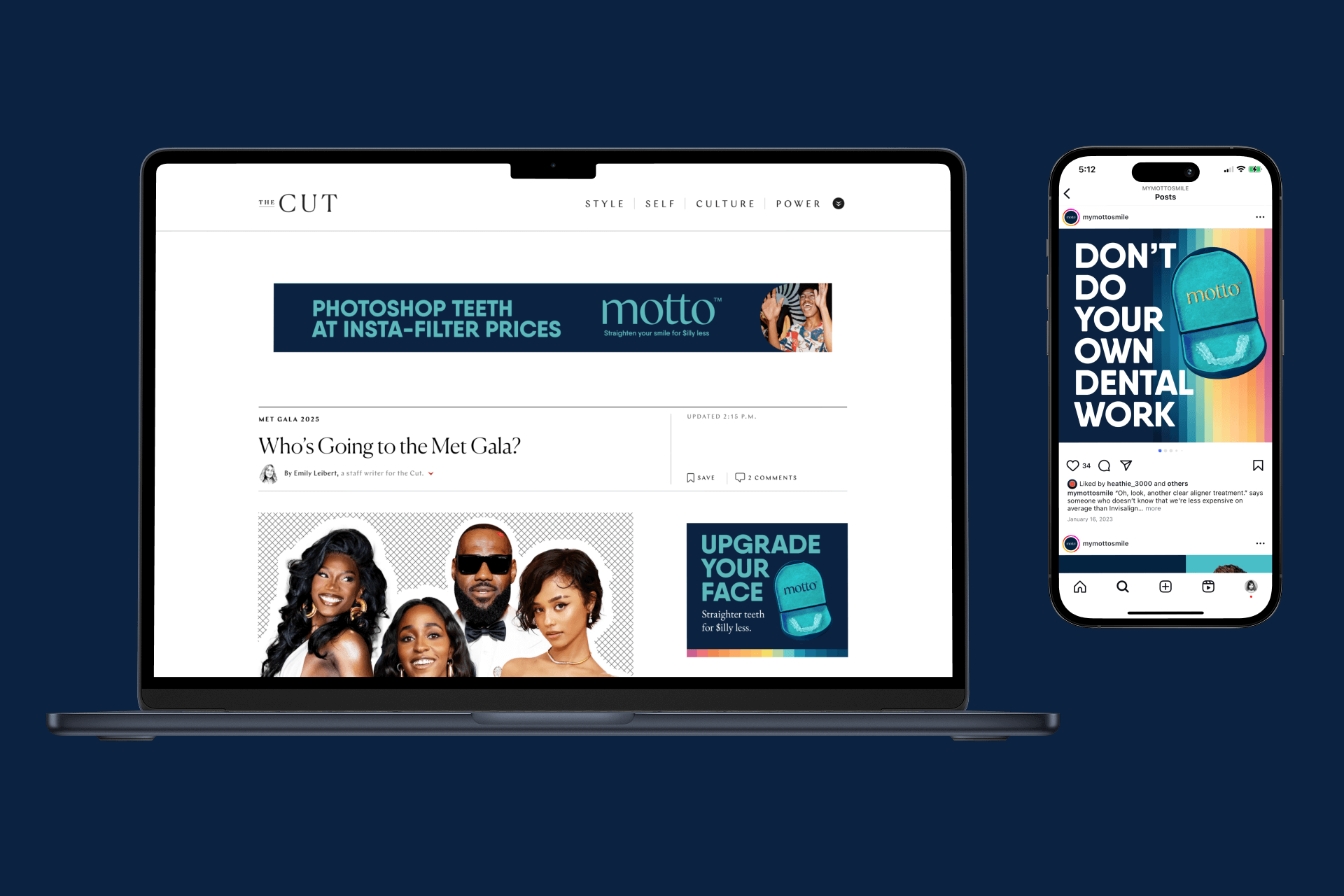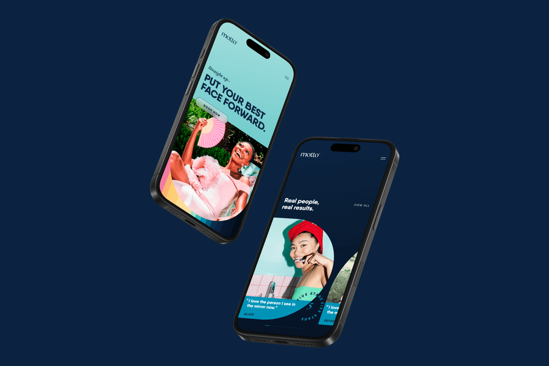
This brand refresh set out to re-introduce Motto as the no-brainer alternative to Invisalign for clear aligner treatment. This cross-channel concept is rich, with a bold and playful brand personality that’s uniquely ownable and disruptive in a sea of smiley sameness. I served as graphic designer for the brand style guide, which provided Motto's internal design team with direction to bring the new vision to life.
Client —
Motto
Credits —
Agency: Chalk 242
Founder/Director: Heath Miller
Founder/Executive Director: Sarah-Mai Pugh
Creative Director (Art/Design): Jonathan Nielson
Creative Director (Copy): Tim Casart
My Role —
Graphic Design, Concept Development and Design Ideation Support


Logo and Color:
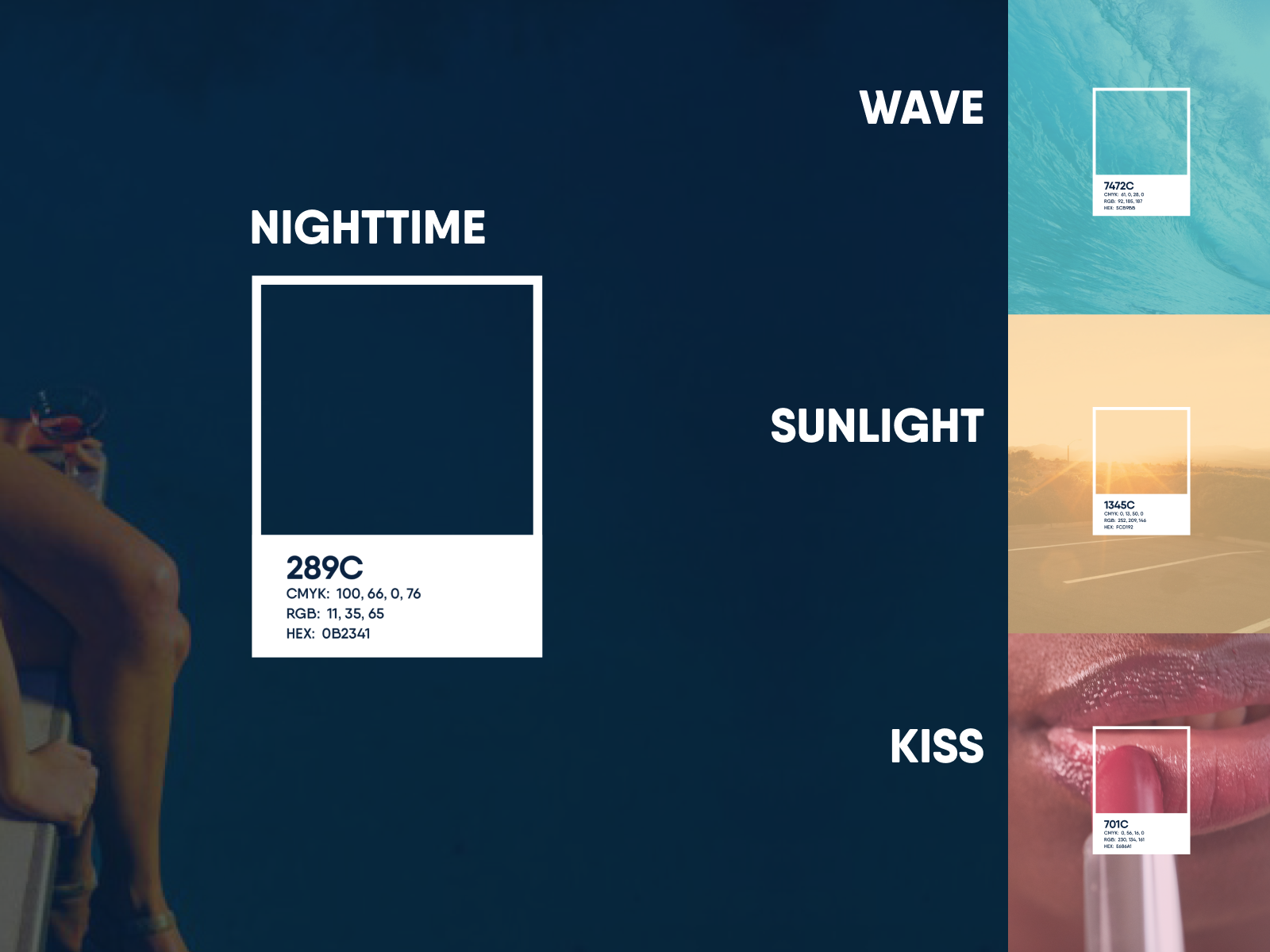
The wordmark strikes a balance between precision and humanity with a serif that feels warm and supportive. The symbol serves as a visual shorthand for industry expertise and functions as a seal of trust for the audience. The primary brand color, Nighttime creates recall for the brand. Wave, Daylight and Kiss add visual interest and guides the viewer's eyes.
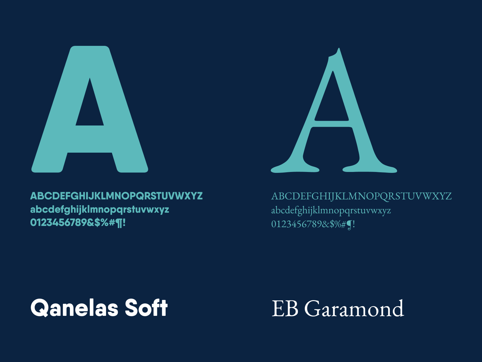
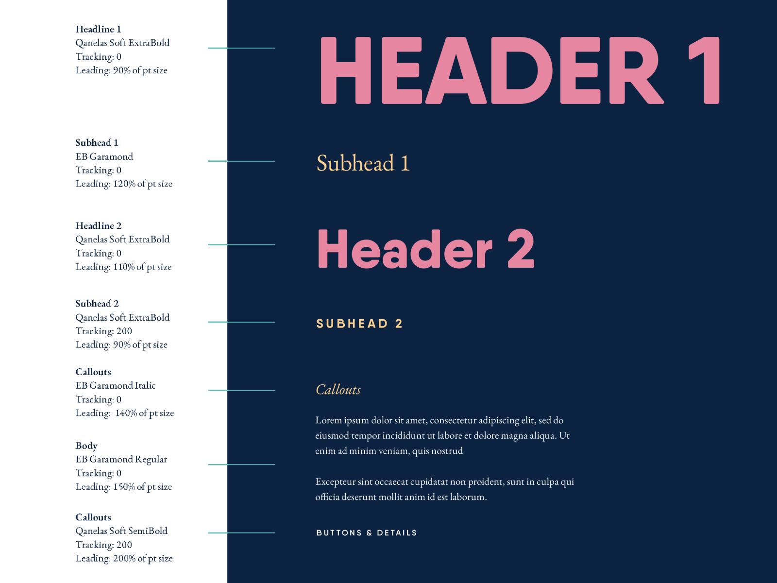
Typography:
Qanelas Soft is a modern sans serif with a geometric, friendly touch. EB Garamond adds readability and unexpected pairing with the Qanelas family.
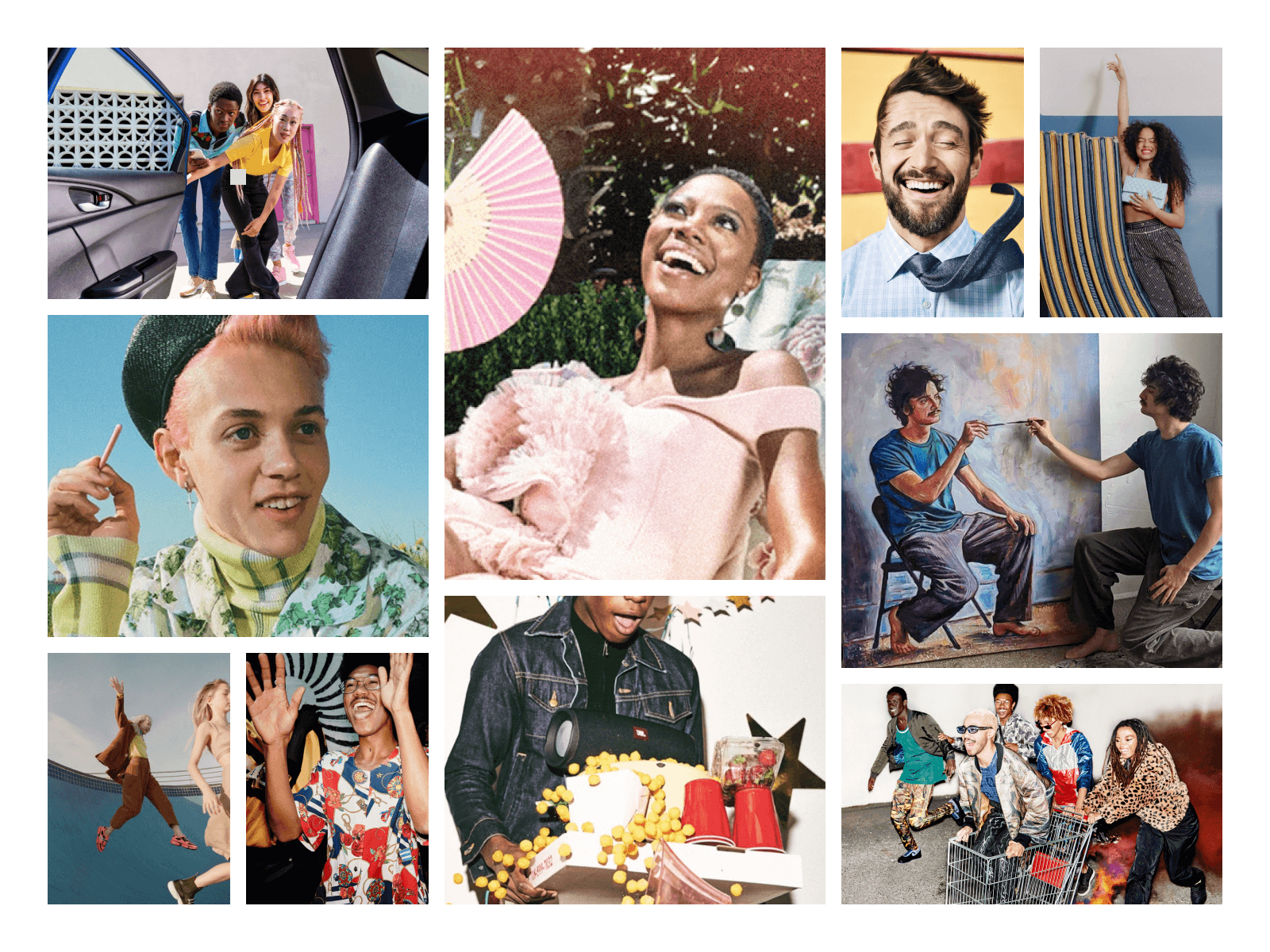
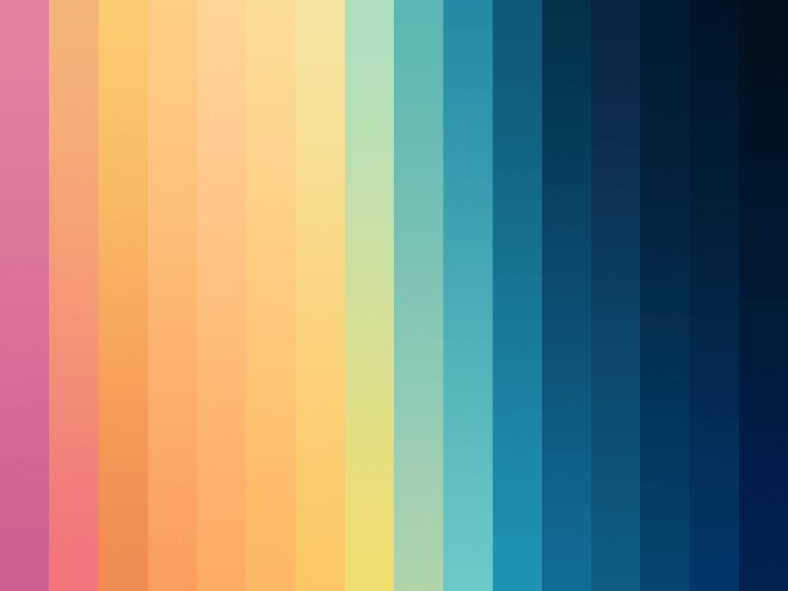
Photo Direction and Pattern:
The photo direction features outrageous, over-the-top expressions and action that creates excitement and joy. Scenes are carefully styled and realistic, with a controlled color palette and rich textures. The pattern adds a playful, yet sophisticated touch to the Motto brand. It can be cropped or flipped for versatility, though not rotated. Also, it can be used as a striking visual layer behind imagery.